Motion design & DOOH
DOOH motion pacing: make the message survive the loop
Plan outdoor motion for viewers who arrive midway: protect the message, give animation one job and review holds, scale and the end-to-start transition.
 By Ed McCulloch ·
An outdoor animation does not begin when a passer-by looks up. They may catch a transition, see only the middle of a slot or turn away before the final frame. A sequence that explains itself neatly from the beginning can lose its meaning when encountered in fragments.
DOOH is a core part of my motion-design practice. For brands and agencies planning outdoor creative, I recommend treating the readable message as the foundation of the loop. Motion should give that message emphasis without making the viewer wait for permission to understand it.
Confirm the placement before setting the rhythm
Ask for the booked duration, screen dimensions, permitted motion level and current delivery specification. Ocean Outdoor’s UK creative guidelines distinguish full motion, subtle motion and static creative, and direct producers to the individual location specifications. That distinction changes the idea before it changes the export.
Build a pacing plan for the actual placement. A pedestrian space may offer opportunities to pause, but that does not establish how long anyone will watch. Do not spend the whole slot on a reveal simply because the file can contain one. Agree the essential copy and brand identification before deciding what moves.
Keep the message available while something else changes
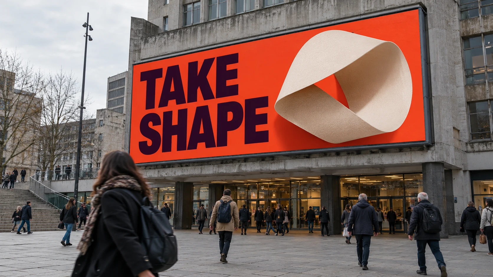
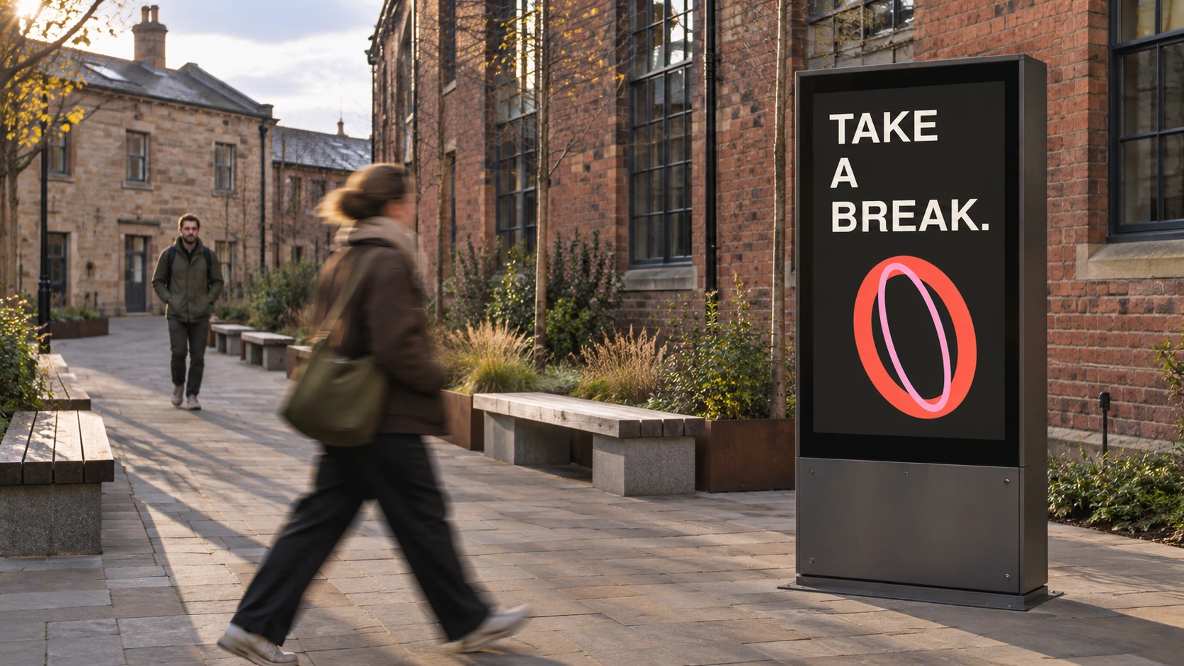
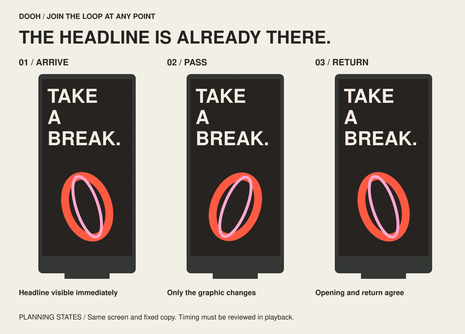
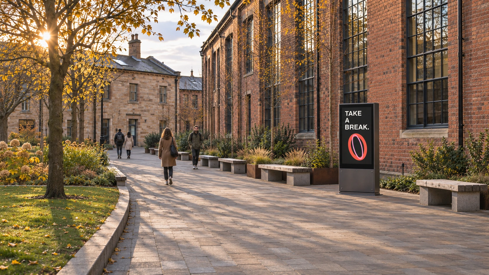
The courtyard totem shows TAKE A BREAK above one coral-and-pink orbital form. The pedestrian crossing in front gives the image a practical context: someone may notice the screen after the loop has already begun. A proposed motion treatment keeps the headline fixed while only the graphic changes orientation, subject to the operator’s permission.
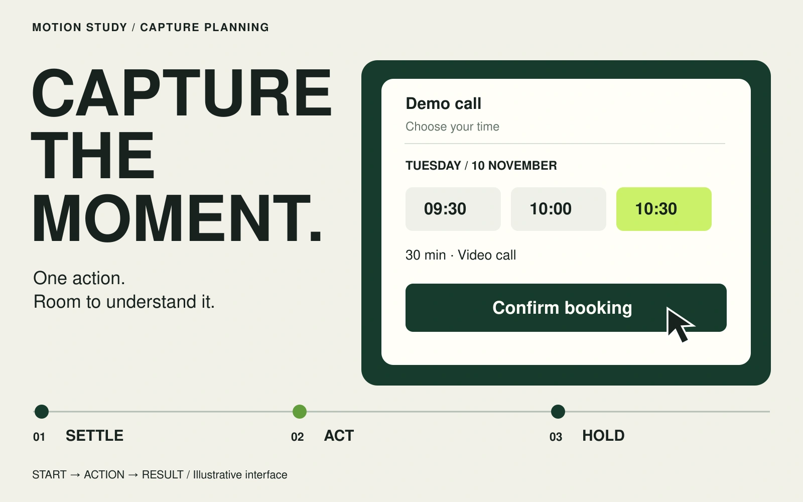
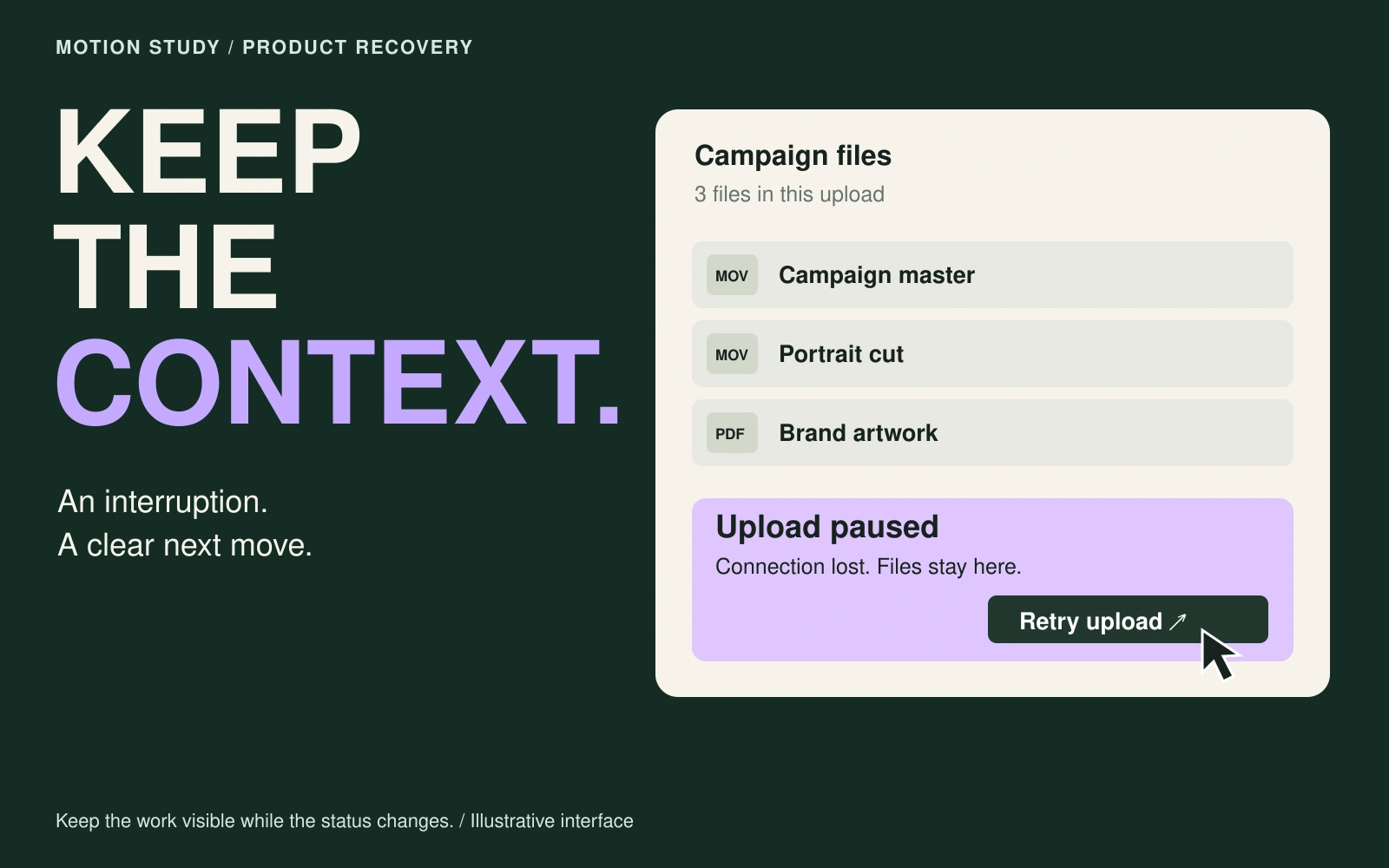
The supporting screen sequence makes that rule explicit across arrival, movement and return. For a real campaign, include the approved brand and required message in the stable hierarchy. If a product reveal needs several stages, ask what each stage communicates on its own; an abstract opening is weak when the viewer never reaches the explanation.
Give motion one clear job
Choose what the animation adds: directing attention to the product, clarifying a relationship or creating a distinctive moment. Keep the most important reading area stable when another element moves. Avoid asking the viewer to follow moving type and inspect a changing image at the same instant unless the idea depends on that relationship.
Plan a readable hold as part of the design, not as time left over after the animation. There is no universal hold length for every headline and placement. Review the actual wording, scale and pace together, then shorten the movement or reduce the copy if they compete.
Review the screen inside the environment
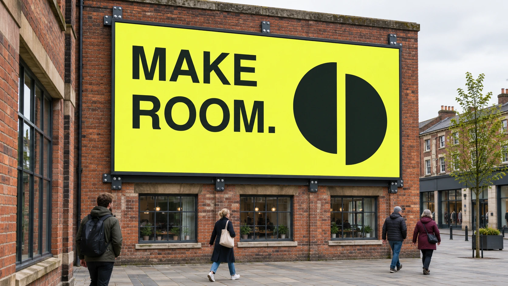
The wider companion view places the screen deeper in the pedestrian approach, among benches, planting and the brick facade. Its role is to show the visual competition around the message. A clean artwork frame cannot explain how much of the viewer’s attention the surrounding space may occupy.
For an actual review, use surveyed placement information and a correctly scaled mock-up. Check approach angles and likely obstructions, then judge the animation with sound off from several starting points. The generated companion viewpoint is an illustration of the same setting, not a measured distance or legibility test.
Check the join and the interrupted view
Review the last frame followed by the first. Look for an unwanted blank frame, a positional jump or an abrupt brightness change. A deliberate cut may suit the concept; an invisible loop is not mandatory. What matters is whether the return supports the message and the booked playback arrangement.
Watch the proposed animation from several starting points, with sound off, in a placement mock-up. Ask a reviewer what they understood before explaining the idea. Inspect the exported file as well as the working composition, and confirm the operator’s requirements before delivery. The placement stills and state plan here illustrate the review questions; they do not demonstrate playback or operator approval.