Motion systems & UI
SaaS demo videos: make recovery part of the story
Show interrupted actions clearly in a SaaS demo: establish the problem, make the next action readable and confirm what changed without inventing product behaviour.
 By Ed McCulloch ·
A product demo often moves directly from a click to a perfect result. That can be appropriate for a short launch film. When the brief is about reliability, onboarding or support, however, a recoverable interruption can explain more than another smooth dashboard reveal.
The useful story is small: something stops, the person understands what to do, and the interface confirms the outcome. For brands and agencies commissioning SaaS motion, that means agreeing the recovery behaviour before designing the transition.
Choose a failure that serves the brief
Start with the question the viewer needs answered. Can they retry an upload? Does their work remain available? Where do they go next? Choose one supported behaviour and obtain approved screens for it. Avoid assembling several unrelated errors into a sequence that makes the product look unstable.
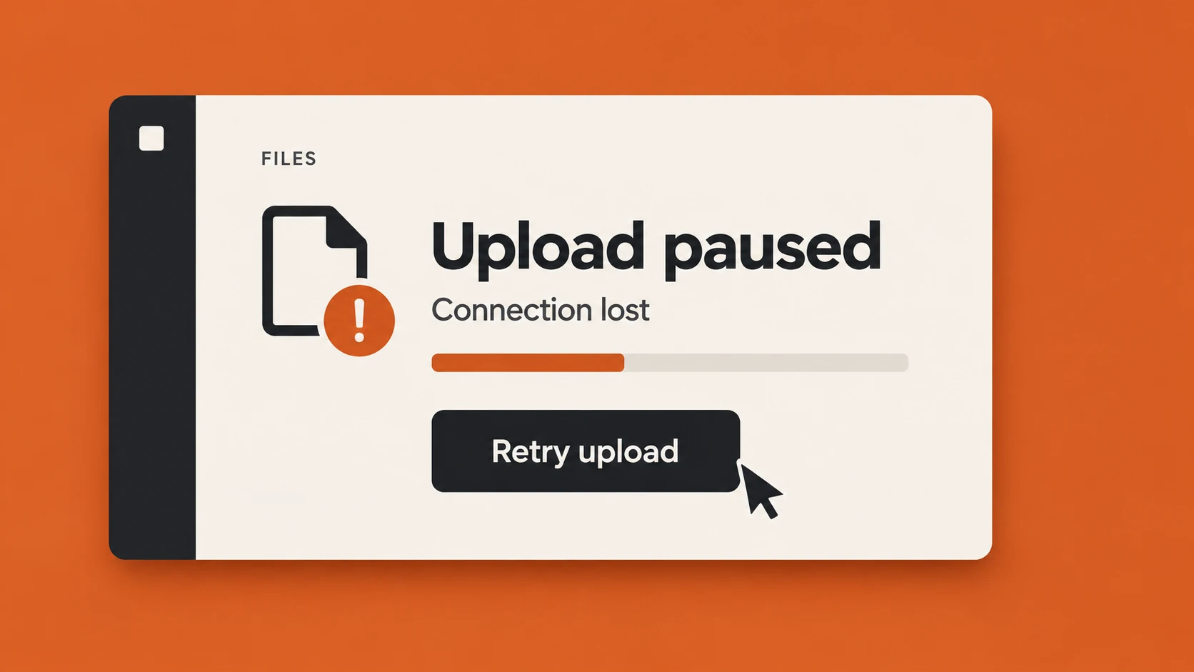
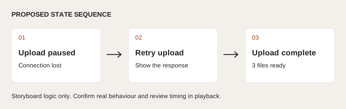
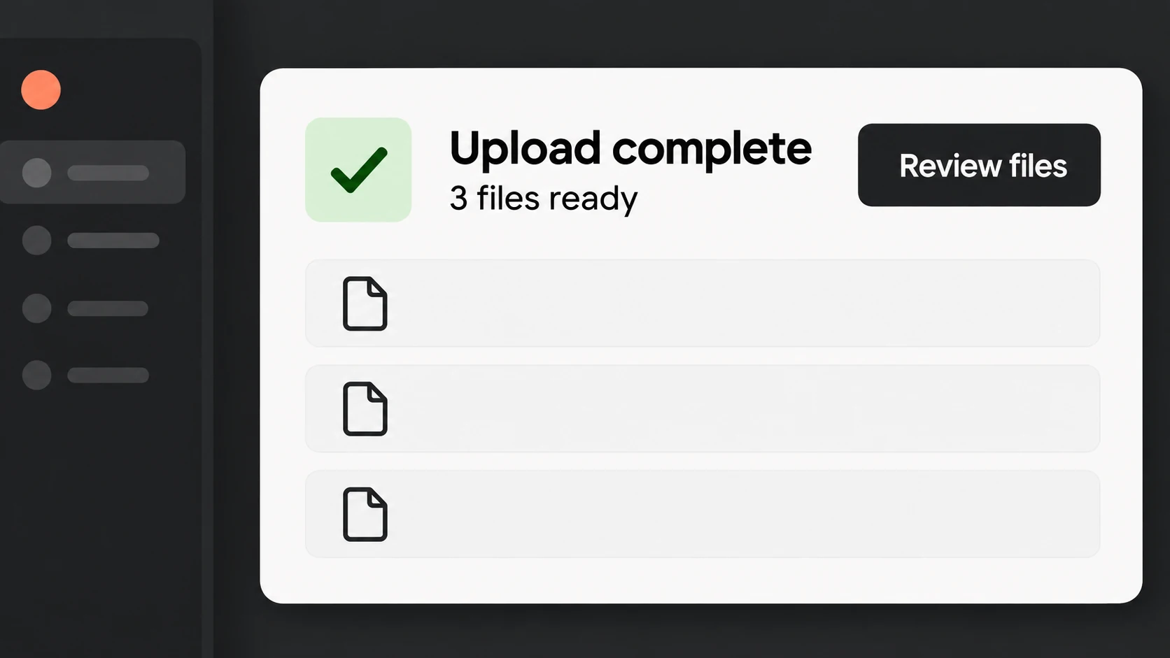
The upload studies here are invented examples. The orange frame shows a paused upload, a stated cause and a retry action. The result frame shows completion and a next step. They are independent AI-generated style frames, not screenshots, a verified continuity test or evidence that a real service supports resumable uploads.
Give the viewer a stable place to look
Keep the relevant panel, file context and action in a recognisable area of the frame. Let the change in status carry the explanation. Moving the entire window, changing the camera angle and introducing a large caption at the same moment can hide the information the sequence needs to communicate.
In a production build, establish the paused state before moving the pointer towards Retry upload. Then show a visible response. If the real product offers a different action, use its approved wording. A motion designer should clarify the interface rather than invent a more convenient one.
Show confirmation, then the next decision
Completion needs more than a green tick. A clear status line can say what finished; a quantity or result can establish what is available; the next control can show where to continue. In this hypothetical frame, Upload complete, 3 files ready and Review files have different jobs.
W3C’s guidance on success feedback recommends making the outcome explicit. Its status-message guidance also addresses how implemented interfaces expose changes to assistive technologies without taking focus. A rendered demo cannot demonstrate that implementation. Keep the film’s communication and the product’s accessibility review distinct.
Plan the holds around reading and response
Give the problem, action and confirmation separate beats. The paused message needs time to register before the pointer moves. The retry needs a visible response before completion. The final state needs enough space for the viewer to understand the outcome rather than merely notice a colour change.
Set those holds in the edit and judge them in playback at the intended delivery size. There is no universal duration that makes every interface readable. If time is compressed, make that clear where it could mislead; do not imply an upload speed or recovery guarantee the product cannot substantiate.
Build from approved states and review the claim
Use supplied screens or rebuild the approved interface as editable elements. Keep text, status symbols and cursor movement separate so revisions do not require replacing the whole scene. Shared layout elements can remain stable while the message and action change.
Review the sequence once for comprehension and again against the actual product flow. Check wording, preserved data, available actions and the final destination with the product owner. Then check the crop, captions and reading holds. The strongest recovery sequence leaves the viewer knowing what happened and what to do next.