Motion systems & UI
SaaS motion design: make one product action clear
Make SaaS and app videos clearer with focused product actions, readable UI, purposeful transitions and an editable motion system for revisions.
 By Ed McCulloch ·
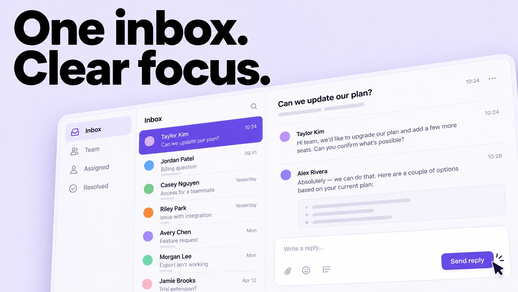
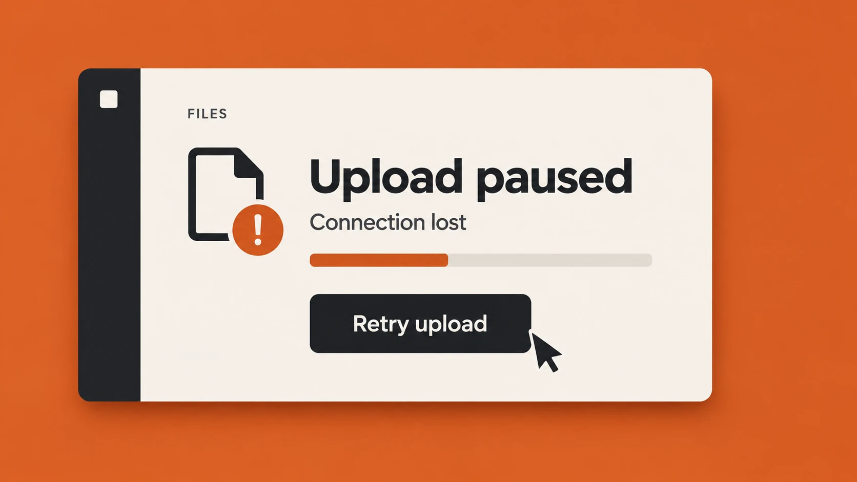
A product video can contain accurate screens and still be difficult to follow. Several windows compete for attention. A cursor moves before the viewer finds it. A transition arrives before the result has registered.
The first planning question is what the viewer needs to understand. One clearly staged product action gives the animation a useful centre.
Choose a message, action and proof
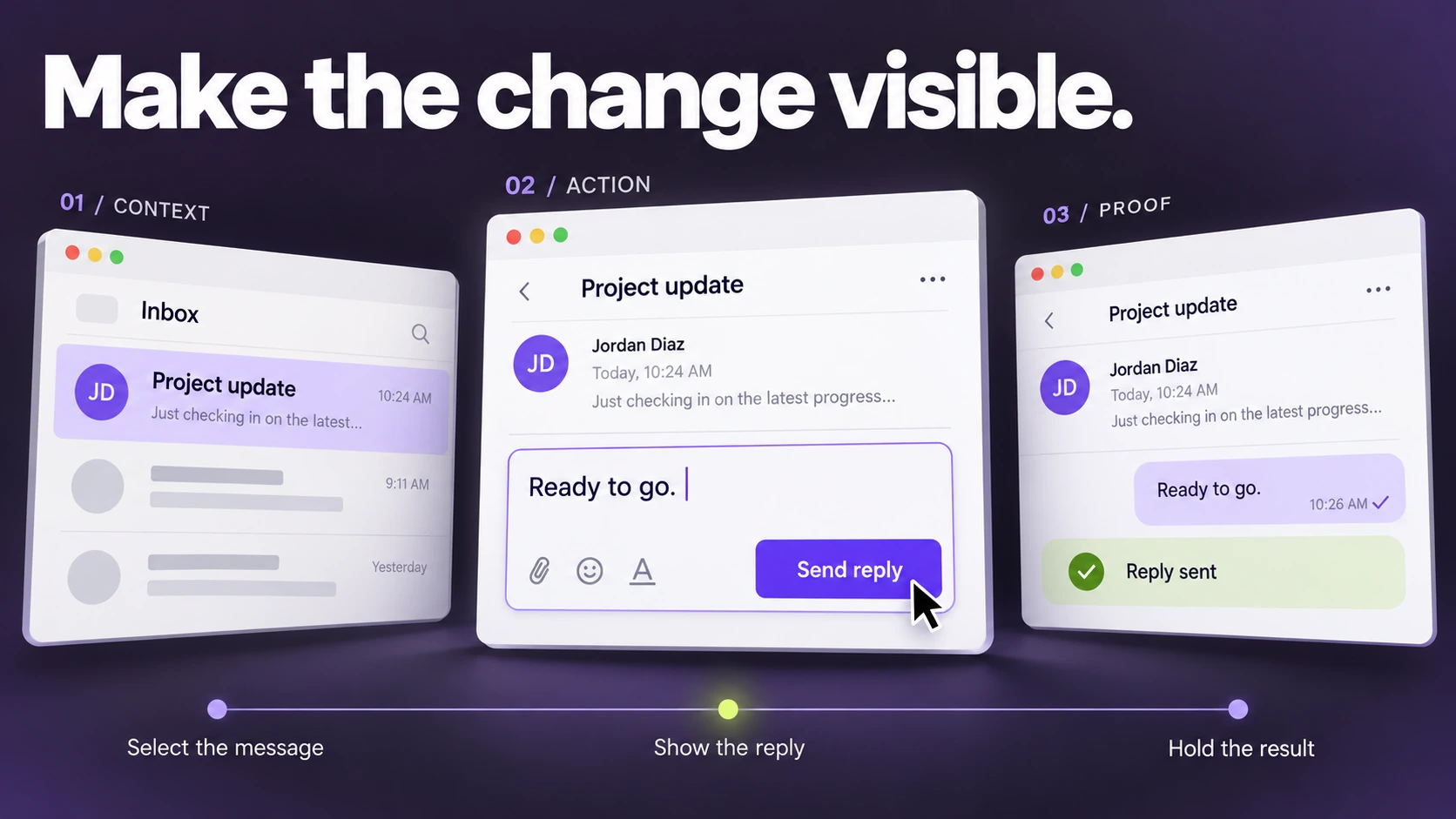
State the message in a sentence. Choose the action that demonstrates it. Then identify the resulting state that proves something changed.
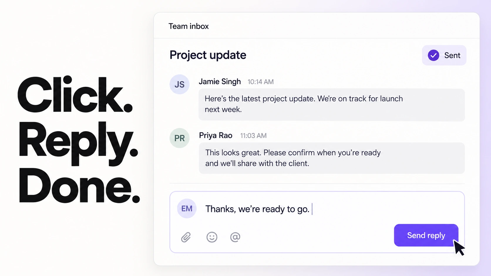
For a hypothetical shared inbox, the message might be that the team can handle a conversation in one place. The action is selecting and replying to a message. The proof is the updated conversation state. Use the actual product behaviour as the authority when designing a real sequence.
Decide what the viewer should look at
Use scale, contrast, position and timing to create an order of attention. An interface does not need to stay at full-screen scale throughout a film. A tighter view can reveal the action, provided the sequence preserves enough context to remain understandable.
Reduce competing movement around an important click. Give the result a readable hold. Test the sequence at the intended playback size, rather than only inside a large composition window.
Use transitions to explain relationships
A panel can expand to reveal detail. A selected item can carry through into the next state. A group of messages can resolve into an organised view. Each transition has a reason grounded in the information.
Choose the simplest movement that explains the relationship. A transition earns its duration when it helps the viewer understand where something went or what changed.
Make the build editable
Product screens, copy and timing can change during review. Plan the build so those changes can be made deliberately. Separate content from animation controls and keep repeated behaviours consistent.
Where the same card, label or interaction appears repeatedly, expressions or scripts can help manage timing and variation. Use them when they make revisions clearer and safer, rather than adding a system to a one-off movement that is already easy to edit.
Check the result against the brief
Watch the film without pausing. Can someone identify the action and its outcome? Does the on-screen copy support the same message? Does the ending leave enough time for the intended next step?
Then inspect the detail: screen accuracy, cursor placement, text, spacing, brand assets and the final crop. Clarity at normal speed and precision up close are both part of the job.