Motion design & DOOH
Designing motion for outdoor screens: start from the pavement
A practical approach to outdoor motion design: viewing angle, silent storytelling, readable holds, motion permissions and screen-specific delivery.
 By Ed McCulloch ·
A motion sequence can look convincing full-screen on a laptop and lose its point on a building. The problem may be the viewer’s angle, the size of the message or the moment they arrive. Outdoor design starts with those circumstances.
Before animating, describe the encounter: someone crossing a square, walking towards a station panel or waiting opposite a screen. That gives the creative a useful constraint. What should this person understand during a partial, silent look?
Find out what the booked screen allows
Request the current specification for the exact placement. Confirm pixel dimensions, duration, frame rate, accepted file type and whether the booking permits full motion, limited movement or static artwork. A digital screen does not automatically mean an animated deliverable.
JCDecaux’s current UK specification table distinguishes static roadside formats from motion-capable environments. Ocean Outdoor also separates full motion, subtle motion and static treatments. Use the operator’s placement-specific instructions; avoid carrying assumptions from another booking into the build.
Design the message before the reveal
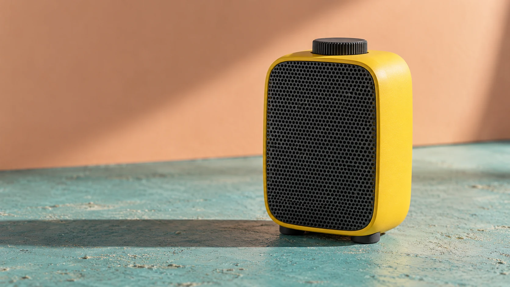
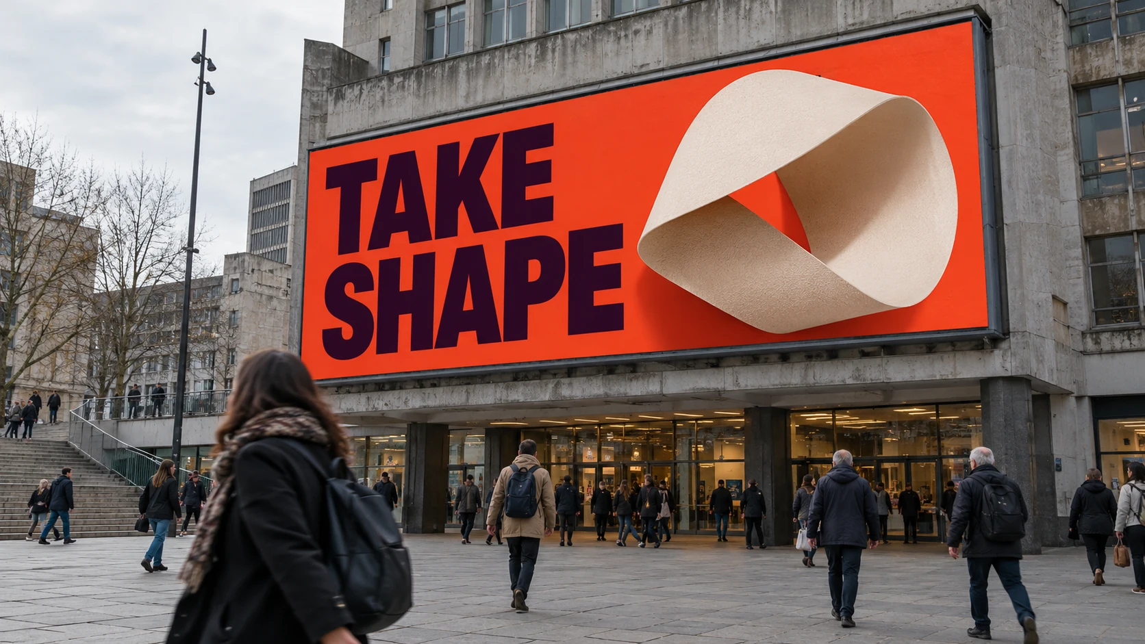
Build a strong held frame first: one message, a clear focal point and the brand information the brief requires. In the hypothetical orange screen study, two large words and one folded form establish the hierarchy. There is no small explanatory paragraph competing with the idea.
Then decide what movement contributes. It might turn the folded form, reveal a product feature or direct attention towards the headline. Keep useful information available through that movement. If the entire message appears only after a long build, someone arriving late may see decoration and miss the purpose.
Give the viewer several ways into the loop
Review the sequence from the middle as well as the beginning. Could someone understand the subject without seeing the first transition? A long transformation may suit a setting where people wait; a passing audience may need the message to remain visible while a secondary element moves.
Plan deliberate reading holds and a controlled reset. Judge those timings against the booked duration and the encounter, rather than applying one universal rule. Watch the export with sound off: the message and sequence should make sense without an audio cue explaining the cut.
Review from the approach, not just straight on
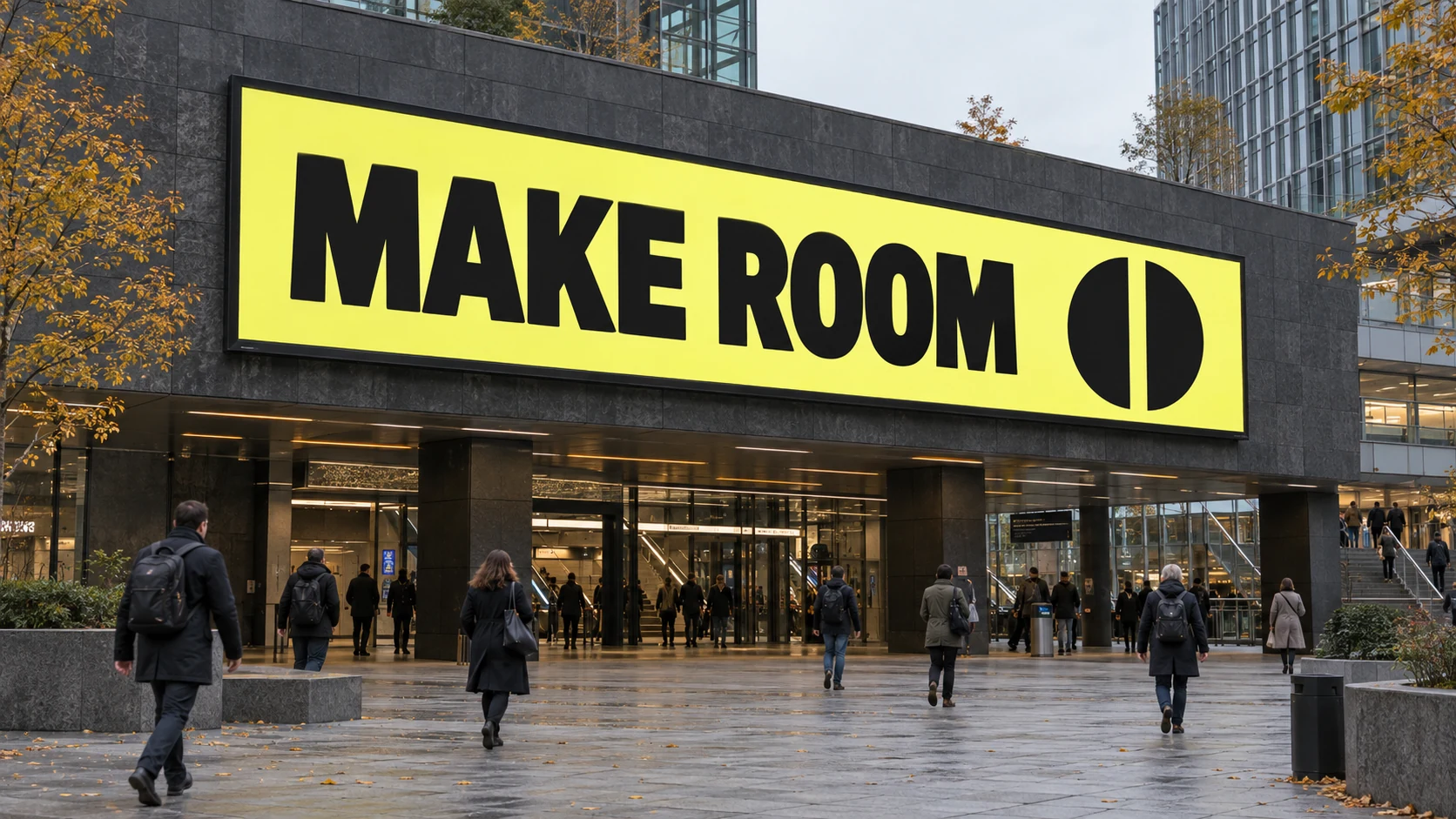
Place the layout in an appropriately scaled photograph or a measured 3D view of the real site when those assets are available. Check oblique approaches, surrounding visual clutter and likely occlusion. A beautiful front-facing mockup can hide problems that appear from the pavement.
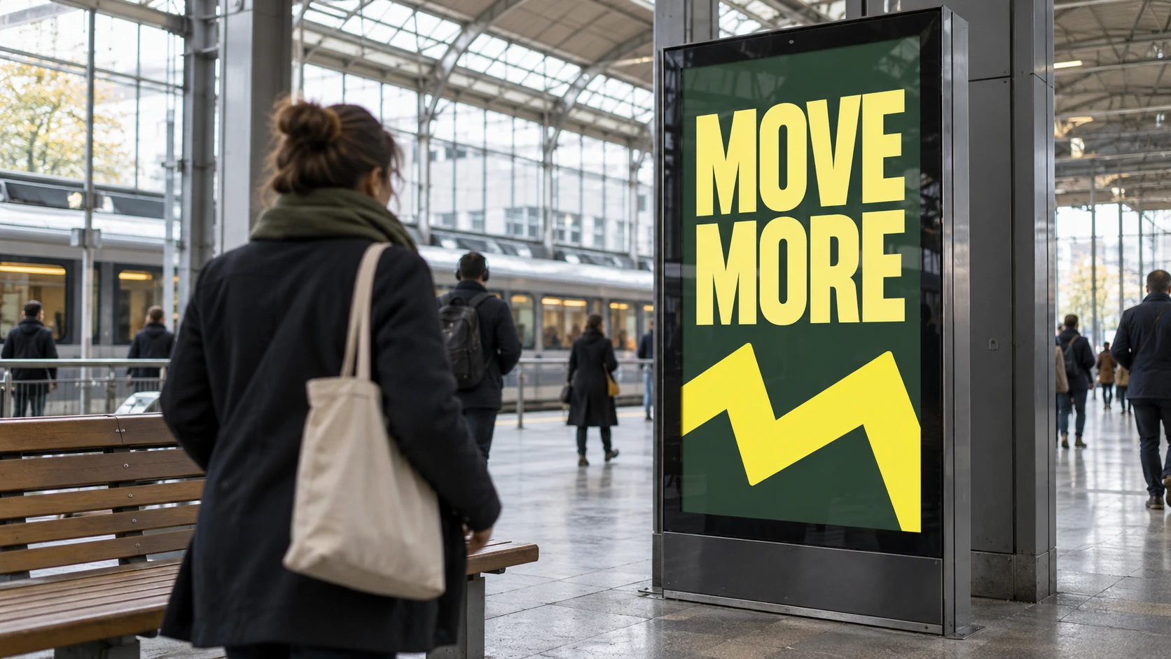
The portrait-screen illustration shows why viewpoint belongs in the brief: the display narrows as the viewing angle changes, and the foreground interrupts the encounter. Both images here are independent AI-generated concept studies, not actual sites, a matched campaign or evidence of a visibility test. Final checks need the real placement and accurate artwork.
Keep the build editable and check the delivered file
In After Effects, separate the message, brand elements and moving subject so their timing and scale can be revised independently. Use shared controls or expressions where several approved versions repeat the same behaviour. Build each layout around its own hierarchy, especially when a broad screen becomes a narrow panel.
Check the exported file’s dimensions, duration, frame rate and encoding against the supplied spec. Inspect the first frame, reading holds and loop boundary as well as the working composition. A useful handover identifies the placement and version, records any assumptions and gives the reviewer a clear way to approve the final playback.