Motion design & DOOH
DOOH format adaptation: keep the idea, rebuild the layout
Adapt outdoor motion across landscape and portrait screens by preserving the message, rebuilding hierarchy and checking each placement’s specification.
 By Ed McCulloch ·
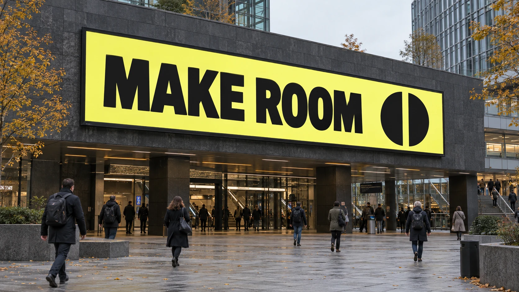
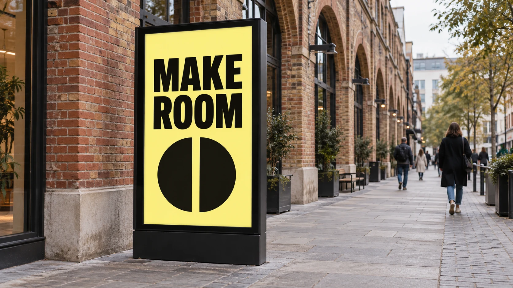
A landscape billboard gives a headline room to run beside an image. A portrait street panel asks those elements to share a much narrower space. Shrinking the whole composition can preserve every layer while weakening the message.
For a DOOH campaign, consistency comes from the idea, typography and motion behaviour. The arrangement can change. Treat each screen shape as a layout decision before treating it as an export setting.
Start with the booked placements, not two generic ratios
Build a delivery list for the actual screens: placement name, pixel width and height, duration, accepted file type, frame rate where relevant and permitted motion treatment. “Landscape” and “portrait” are useful descriptions, but they do not define a complete specification.
Ocean Outdoor’s current production directory lists several portrait proportions and distinguishes static, subtle-motion and full-motion placements. JCDecaux UK also publishes format-specific technical requirements. Request the current instructions for the booking; do not assume that a screen accepts the same treatment as another screen with a similar shape.
Decide which relationships carry the idea
Identify the elements the viewer must recognise across versions. That might be the wording, a product silhouette, a brand mark and one movement. Rank them before rearranging them. If a secondary flourish competes with the headline in the narrow version, reduce or remove it rather than making every element smaller.
The hypothetical MAKE ROOM studies use a short headline and a split circle. In the broad layout, words and symbol can sit beside one another. In the tall layout, the words can stack above the symbol. The message and visual rule survive while their positions change. Neither study represents a real campaign or a tested media placement.
Rebuild the type, spacing and focal point
Work from the final canvas for each version. Set the line breaks deliberately, then judge the headline’s width, spacing and relationship with the symbol. Preserve letter proportions instead of stretching the type to fill the screen. A new line break can change emphasis, so read the wording again after reflowing it.
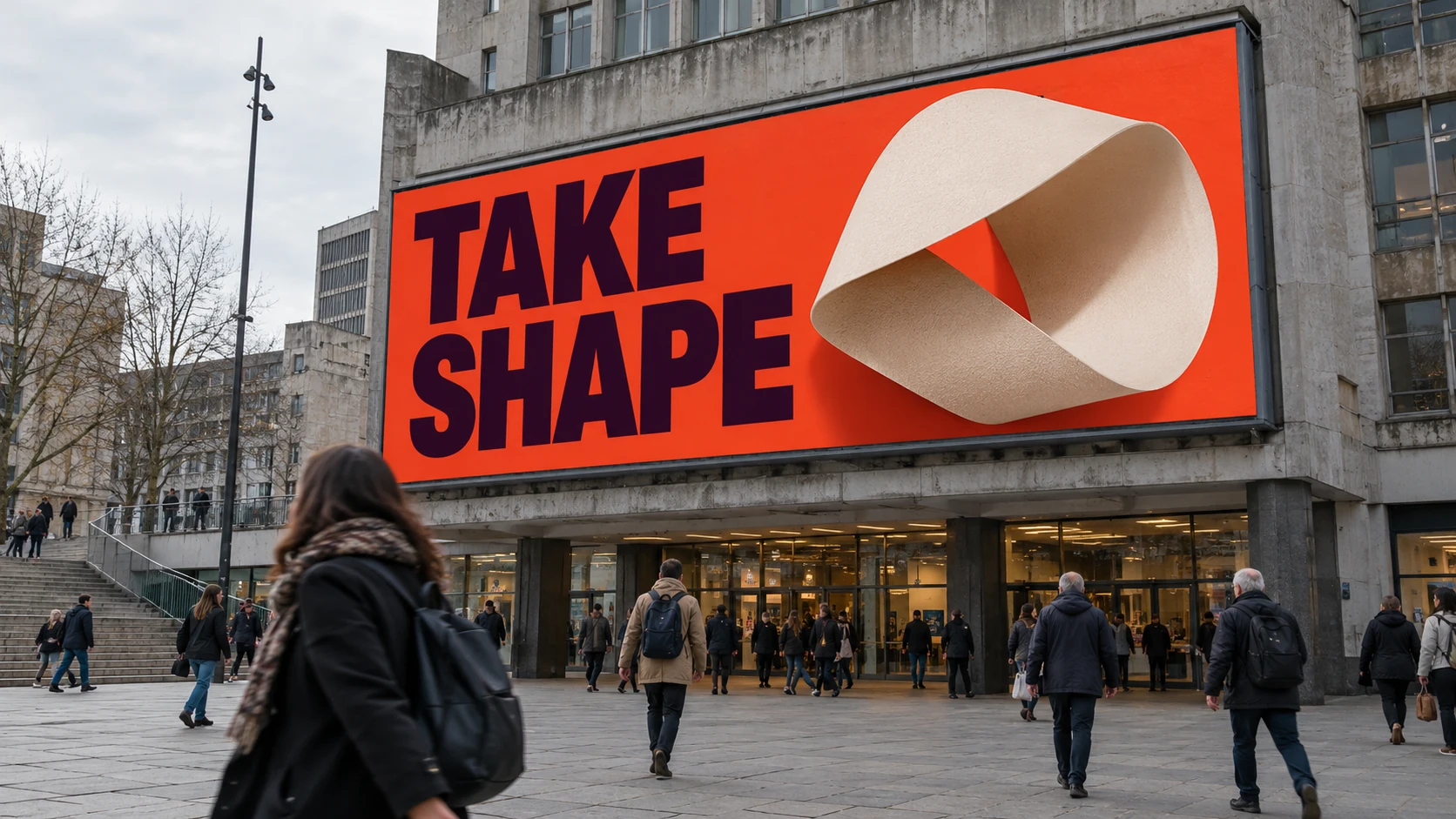
Give each layout its own breathing room. The tall panel can use vertical separation; the broad screen can use horizontal separation. Check the actual artwork at its output dimensions and in a credible view of the placement. Generated mockups are useful for discussing hierarchy, but they cannot establish measured scale, screen brightness or final legibility.
Adapt the movement as well as the held frame
Once the layouts work as stills, decide how the same motion idea behaves in each. A symbol travelling across a broad screen might need a shorter route or a different staging in portrait. Keep the intended emphasis while allowing distance and timing to change.
For the split-circle concept, the two halves could separate while the headline remains available to read. That is a proposed animation, not something these images demonstrate. Any production version must fit the booking’s motion rules. A static placement needs a complete held design, rather than a paused transitional frame.
Share controls, then review each export separately
In After Effects, keep reusable artwork and approved wording organised so revisions can reach the relevant versions. Shared colour or timing controls and scripting can help with repeated changes. Keep layout-specific positions and reading holds adjustable; one set of values will not necessarily suit every screen.
Review the exported files alongside the delivery list. Check dimensions, duration, encoding and required frame rate, then inspect the opening, reading holds and ending. Confirm that important information survives every crop and movement. A campaign family should feel connected, with each version doing its job clearly in its own space.